Crossfit Voraz
Direção Criativa: Leticia Gimenes
Design: Letícia Gimenes
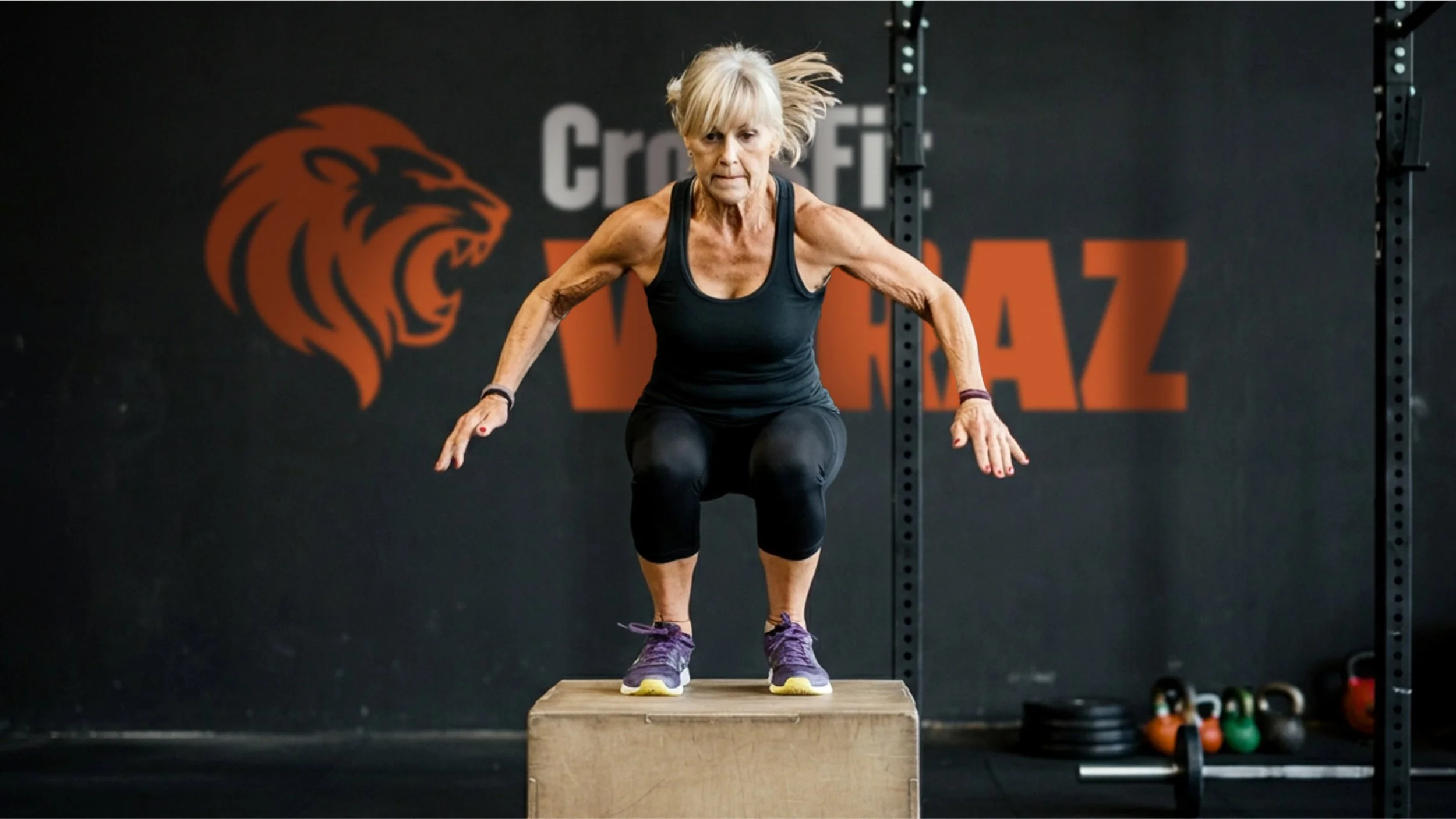
A CrossFit Voraz inicia uma nova fase com o redesign de sua identidade visual, refletindo o momento de modernização vivido pela marca após 10 anos de história e a chegada de uma nova gestão. O projeto busca fortalecer o posicionamento da Voraz como um box que une técnica, intensidade e acolhimento, valorizando sua comunidade e mantendo viva a essência de quem encara desafios com constância e atitude.
[EN] CrossFit Voraz enters a new chapter with the redesign of its visual identity, reflecting a moment of growth and modernization after 10 years of history and a change in leadership. The project reinforces Voraz’s positioning as a box that combines technical excellence, intensity, and a strong sense of community, while staying true to its essence of consistency, challenge, and genuine support.
Conceito Visual
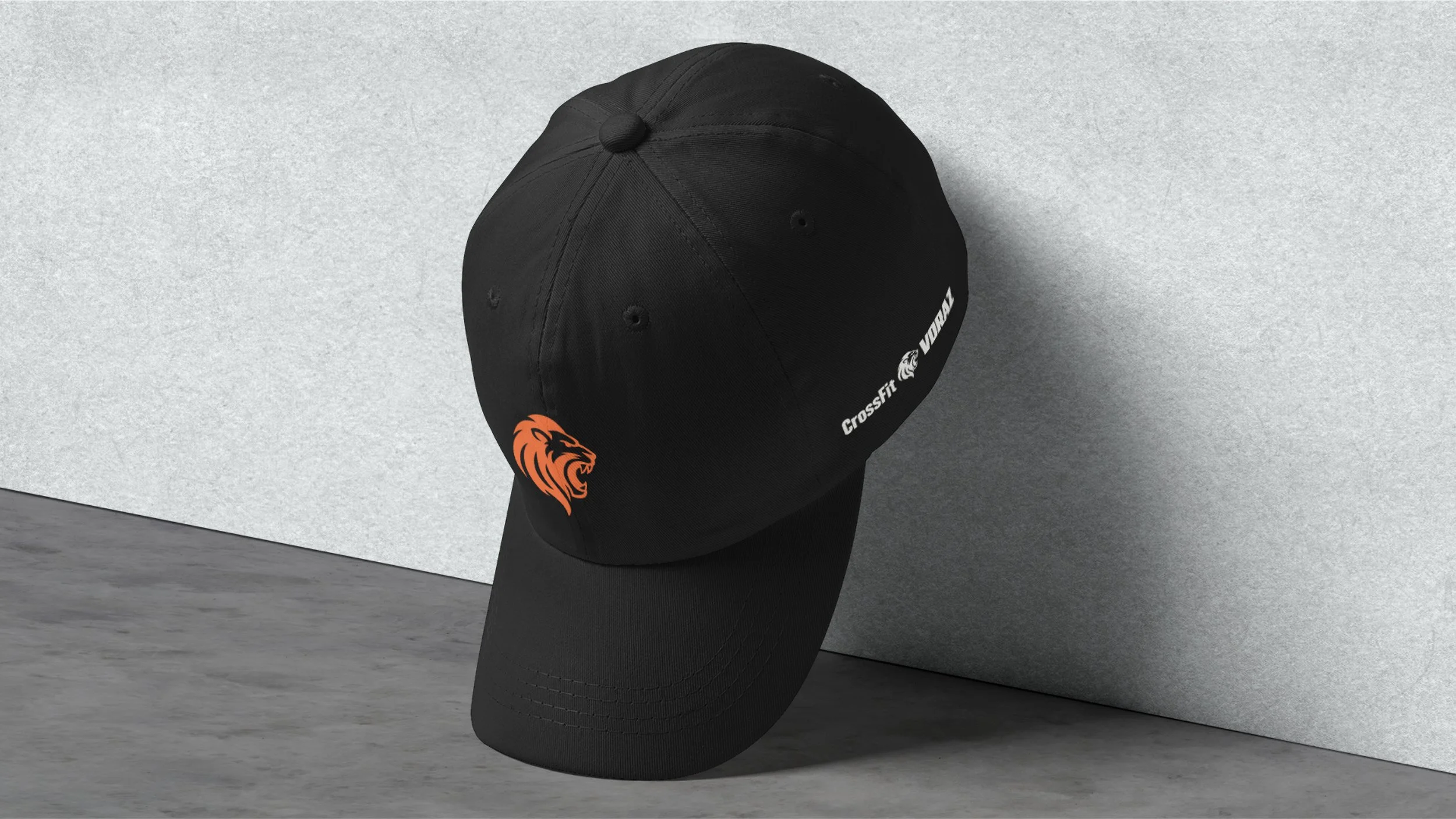
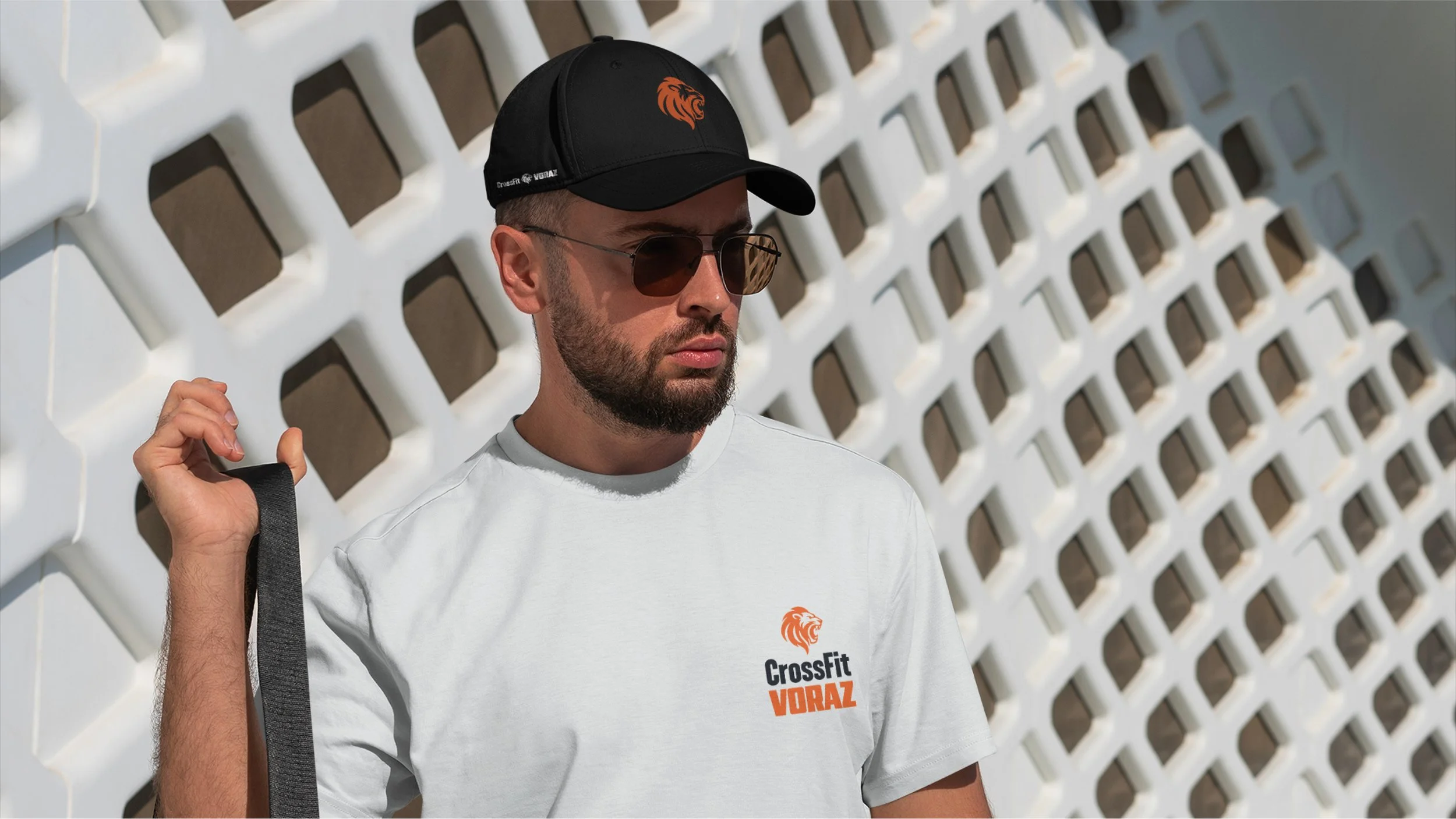
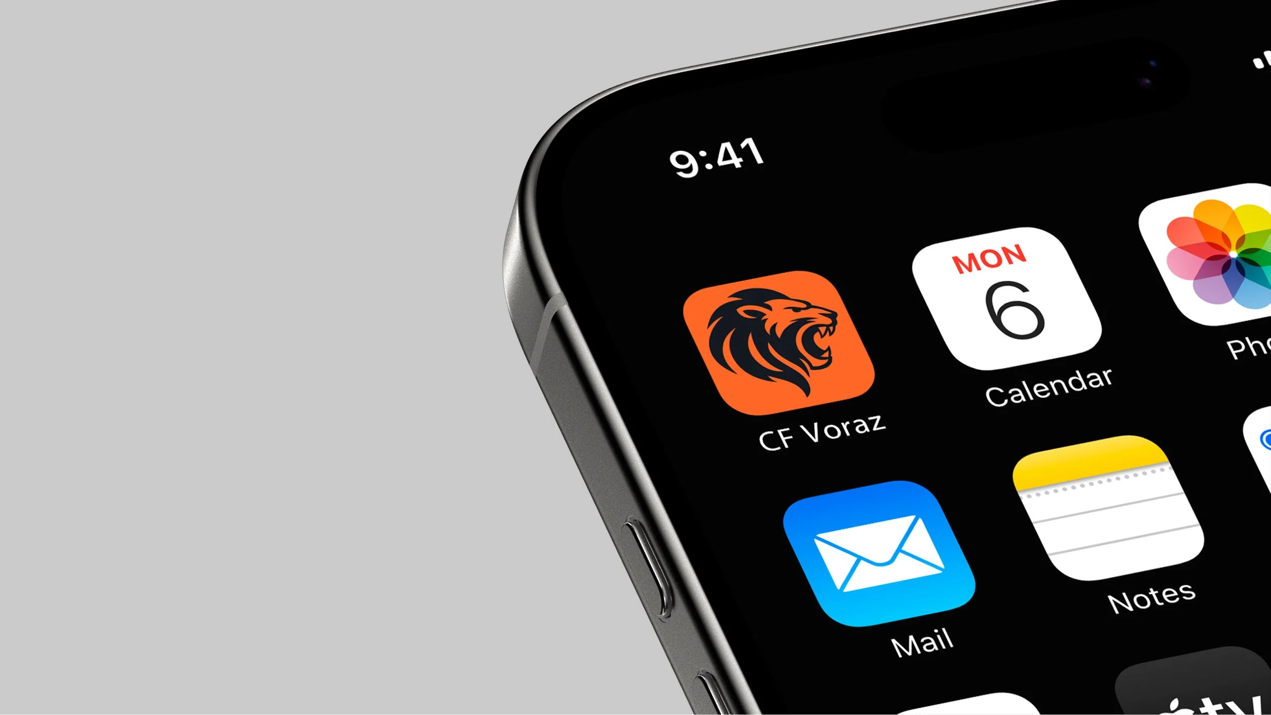
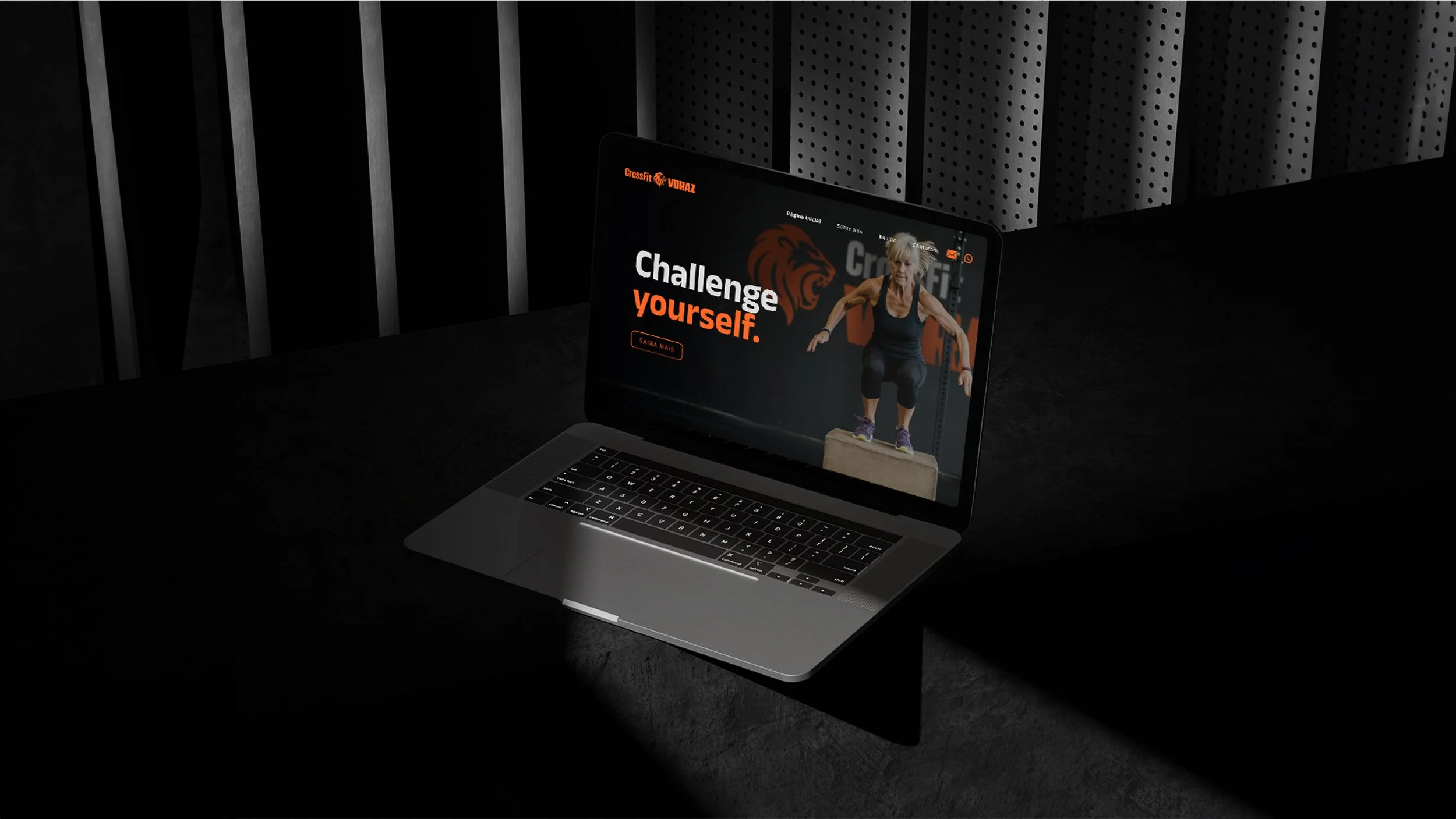
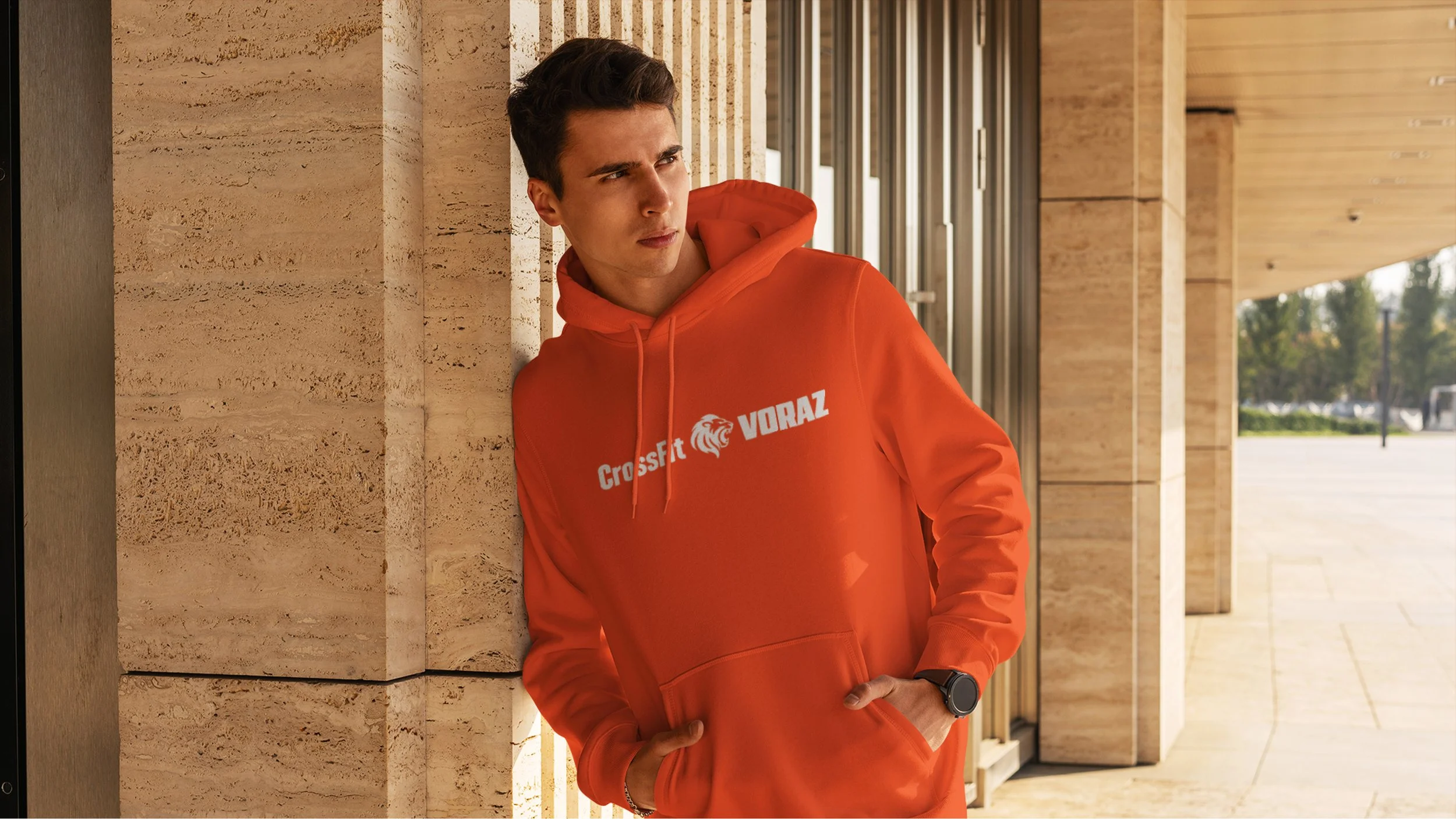
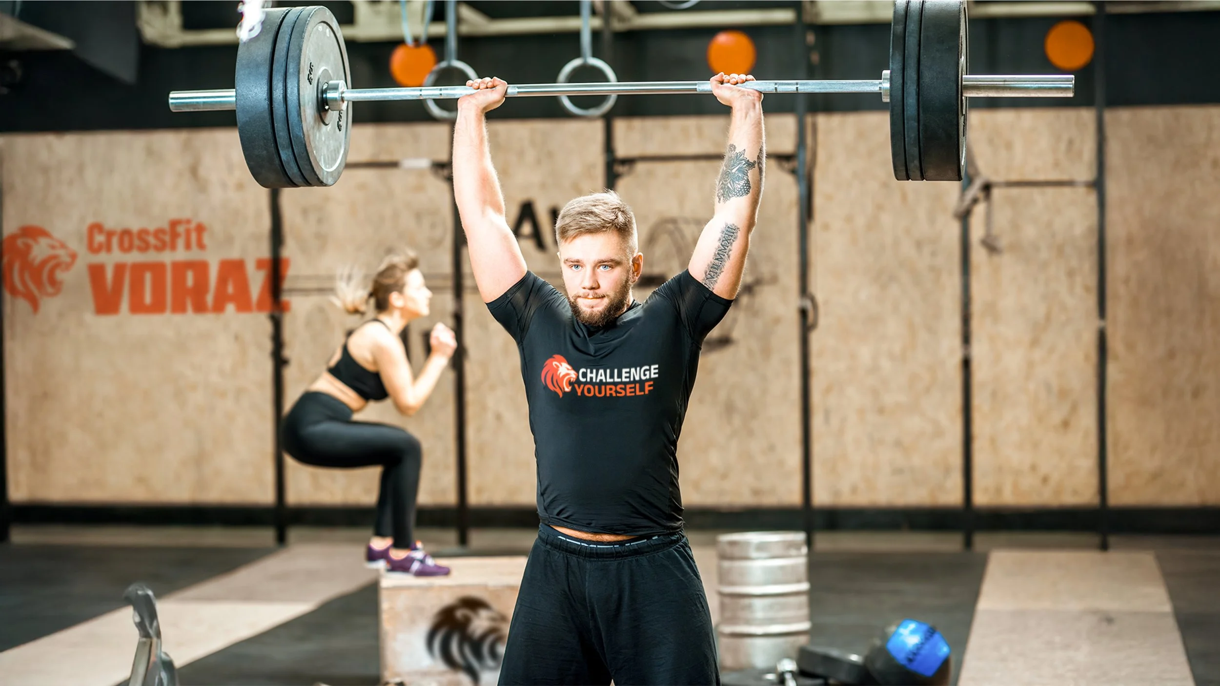
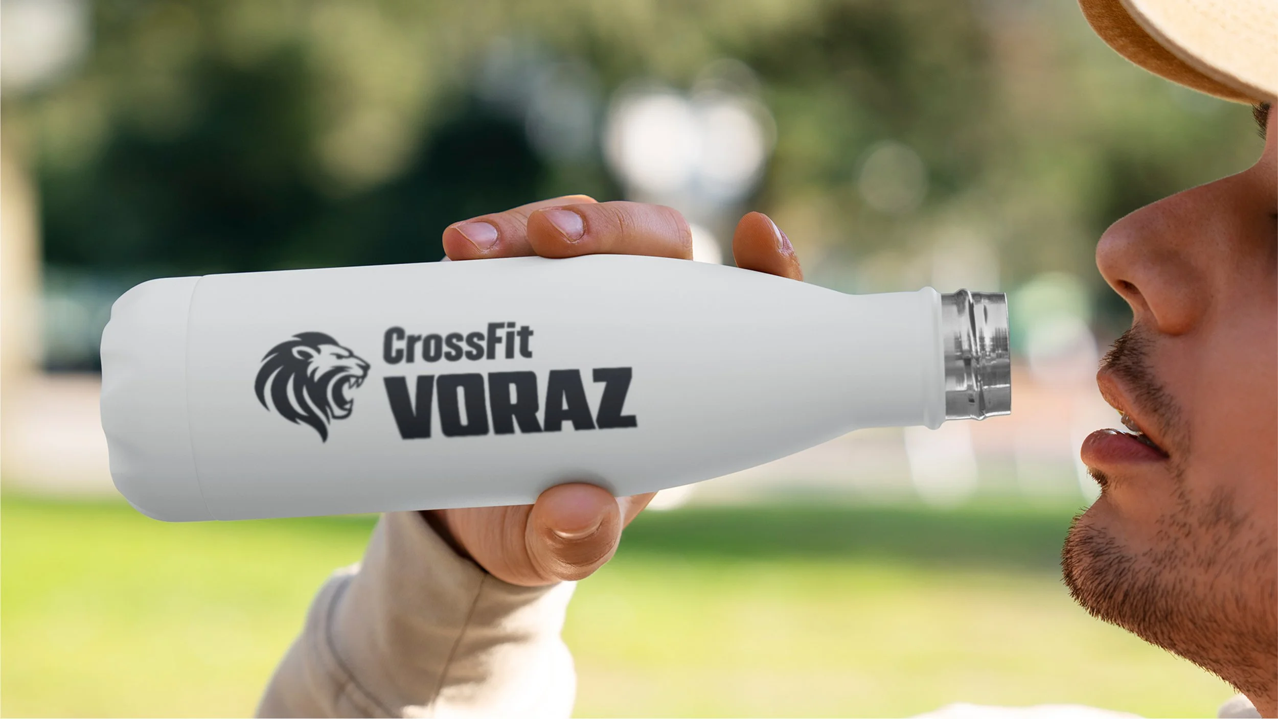
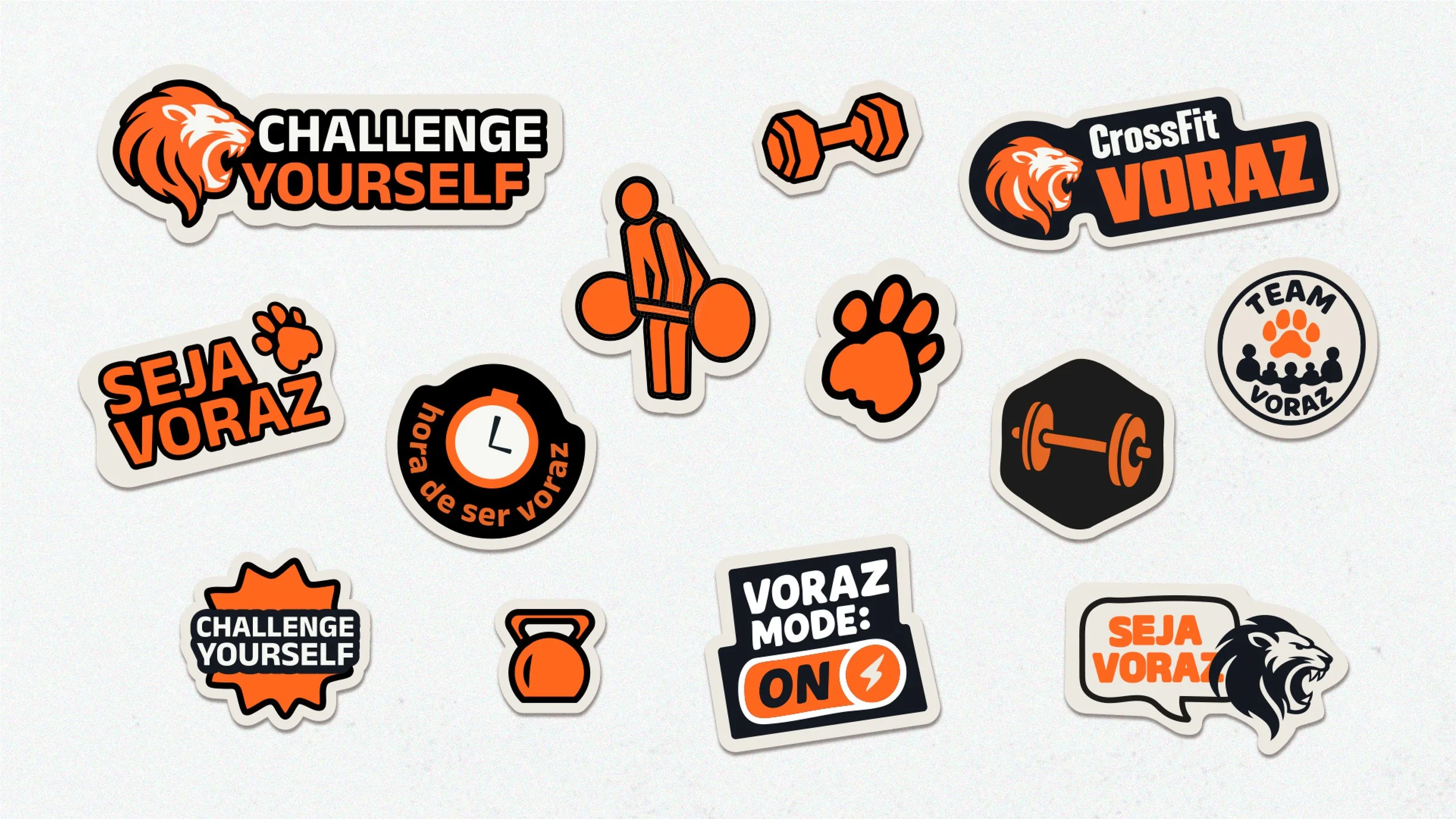
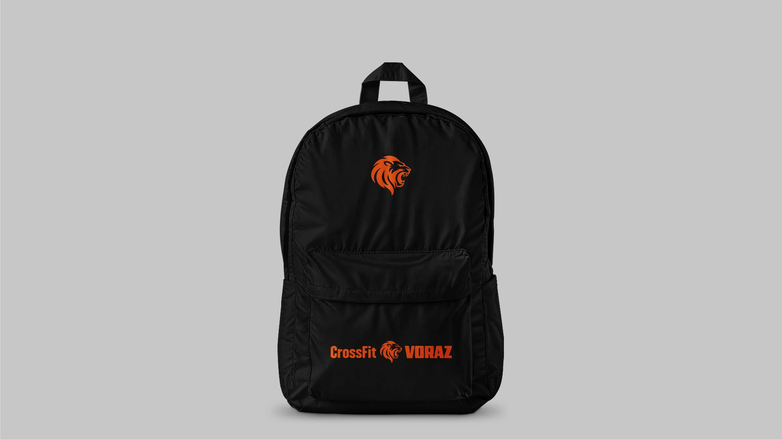
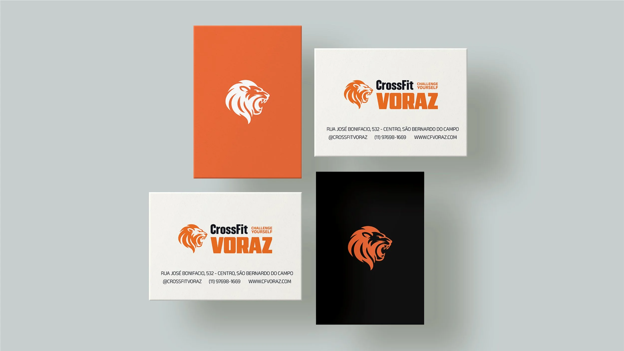
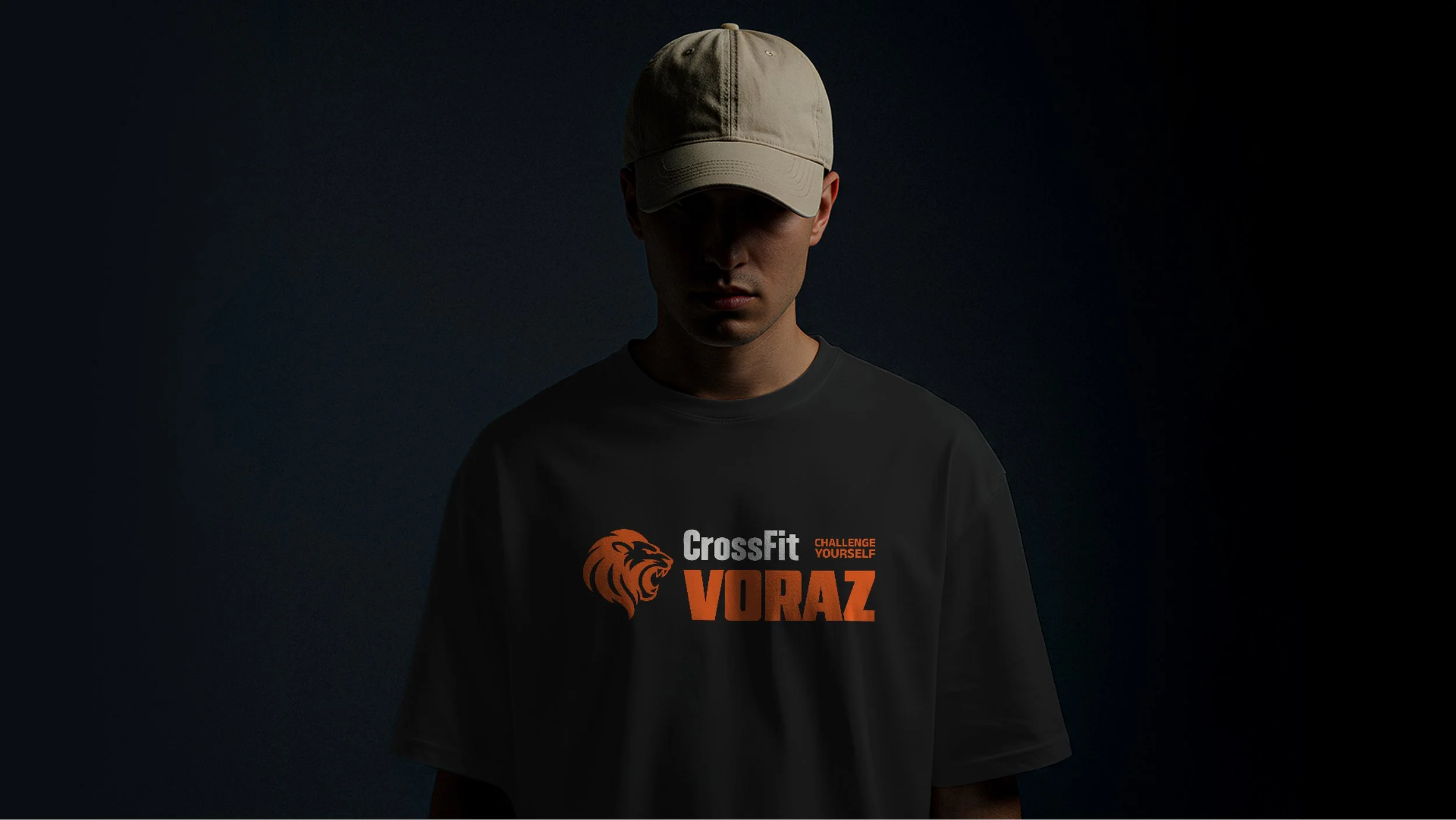
Visualmente, a nova identidade preserva elementos já reconhecidos — como o leão, a paleta em laranja e preto e o slogan Challenge Yourself — agora traduzidos de forma mais equilibrada, moderna e profissional. O símbolo do leão foi redesenhado para ganhar força e definição, a tipografia passou a dar mais protagonismo ao nome Voraz e o sistema visual foi expandido com stickers, iconografia ilustrada e referências ao college americano, garantindo versatilidade, energia e coerência em todas as aplicações da marca.
[EN] Visually, the new identity preserves key elements already recognized by the community — such as the lion, the black and orange color palette, and the slogan Challenge Yourself — now reinterpreted in a more balanced, modern, and professional way. The lion symbol was redesigned to appear stronger and more refined, the typography gives greater emphasis to the name Voraz, and the visual system was expanded with illustrated icons, stickers, and a subtle American college-inspired aesthetic, ensuring versatility, energy, and consistency across all brand applications.

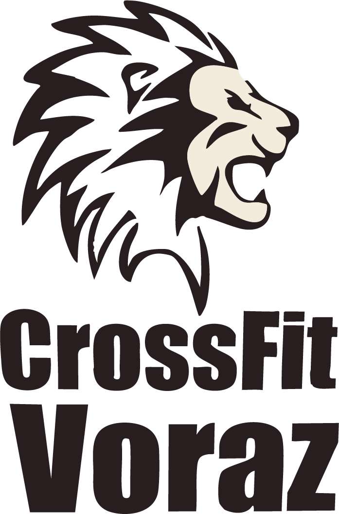
Antes
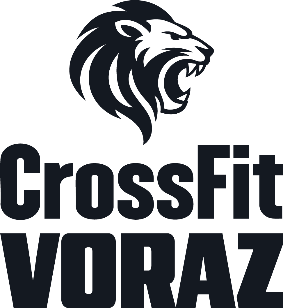
Depois